The inspiration for this blog post came from the successful webinar, “Designing IoT Dashboards to Amaze Your Customers,” presented by Klaus Borges, Lead Front-end Developer, and David Hall, Customer Success Manager. The webinar drew over 100 viewers and provided valuable insights into creating effective and visually appealing IoT dashboards. Due to its success, we’ve summarized the webinar’s key points.
Starting point
For our dashboard design experience, we will go through what we would consider a bad dashboard until one that we consider exceptional. This first dashboard we provide may look good enough if you don’t think much about it.
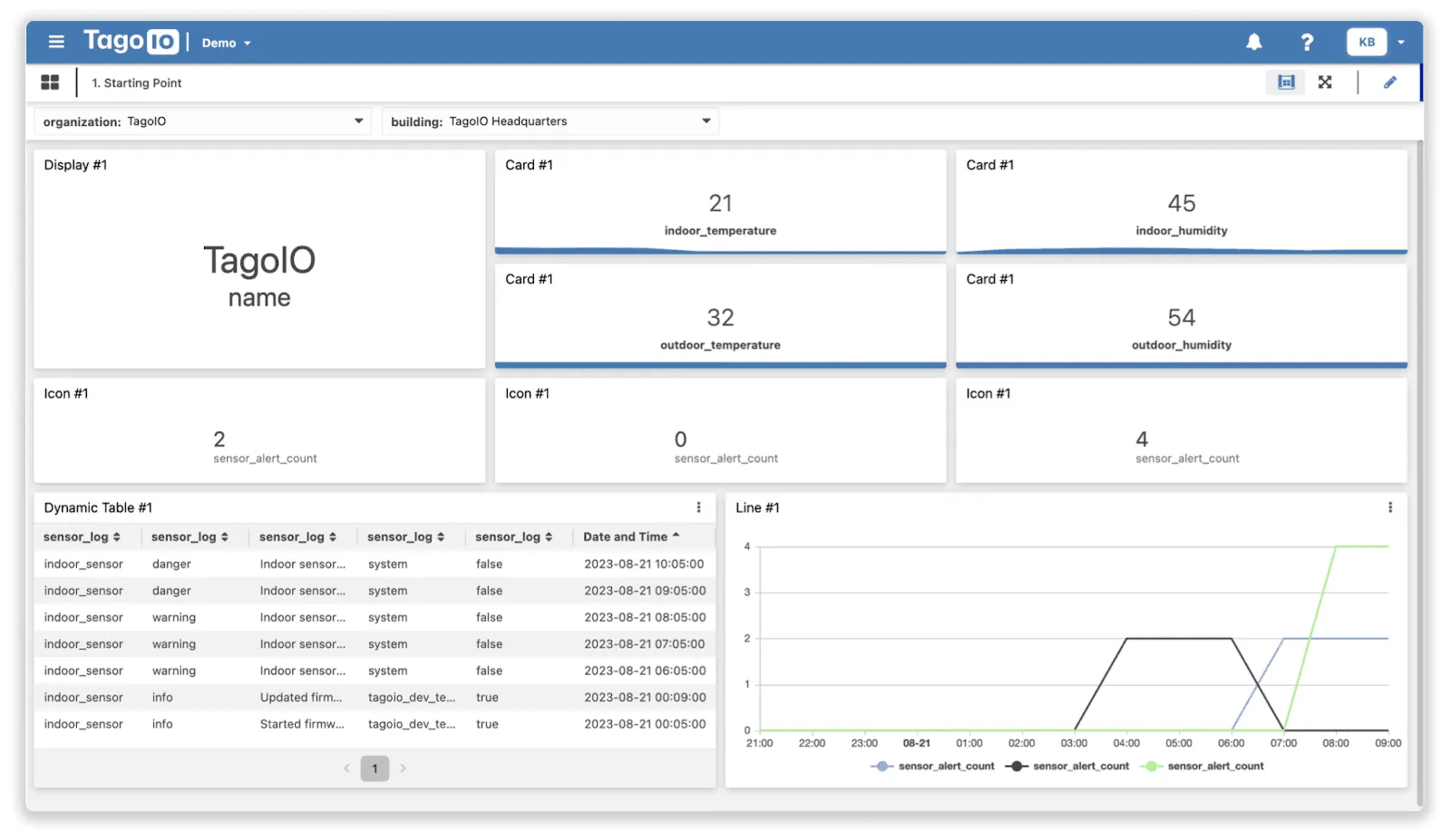
Our journey begins with a dashboard design that may initially seem good enough but has several critical issues upon closer inspection. This dashboard presents all data simultaneously, which can overwhelm users. Here are 6 major problems we identified:
-
Too many widgets: In our experience, we’ve assisted with several dashboards that had too much data and too many widgets. Other than cluttering the interface that will likely overwhelm users, it can also become a bad experience when loading data since widgets can be placed in different “views”: different dashboards, tabs in a dashboard, or a modal dialog that opens when clicking on a button.
-
Lack of Measurement Units: The temperature data lacked units, leaving users unsure if the values were Celsius or Fahrenheit.
-
Cluttered Dynamic Table: The Dynamic Table #1 displayed cramped data, making it difficult to understand.
-
Confusing Alerts: The widgets that show the number of alerts do not specify the severity of the alerts. Someone can get used to that in the interface, but making it explicit is always better in these scenarios.
-
Generic Widget Titles & Labels: Widget titles and labels were too vague, offering little context about the data they represented.
-
Ambiguous Chart Subtitles: The subtitles on the chart labeled “Line #1” were repetitive and did not provide actionable information.
More context
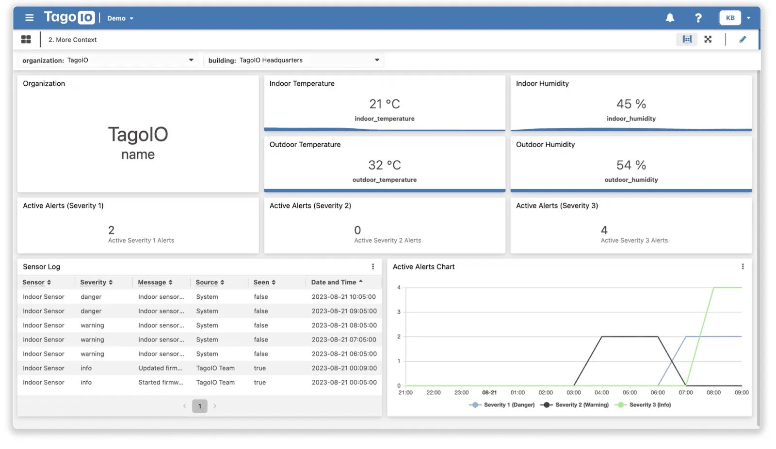
We initiated improvements by:
-
Assigning clear, descriptive titles and labels to widgets that specify what they represent.
-
Adding temperature measurement units (e.g., °C or °F).
-
Updating the Sensor Log table to have clear column names instead of the same variable repeated over and over (everything in the table is retrieved from metadata with Formulas)
-
Updating the Sensor Log table to replace options (which can be IDs that are non-readable) with labels, which can be done with Dropdown fields retrieving static options (defined in the widget) or dynamic options (stored in data records)
-
Revising chart subtitles to indicate severity levels and their respective importance. For instance, severity 1 was designated as the highest level.
The dashboard still doesn’t look great, but since these steps can be taken in any order, this one provides the most benefit when it comes to reducing the frustration of the users: it may look bland and cluttered, but at least reading the text allows the user to make sense of everything.
Visual Improvements
While the dashboard’s functionality improved, its visual appeal needed attention.
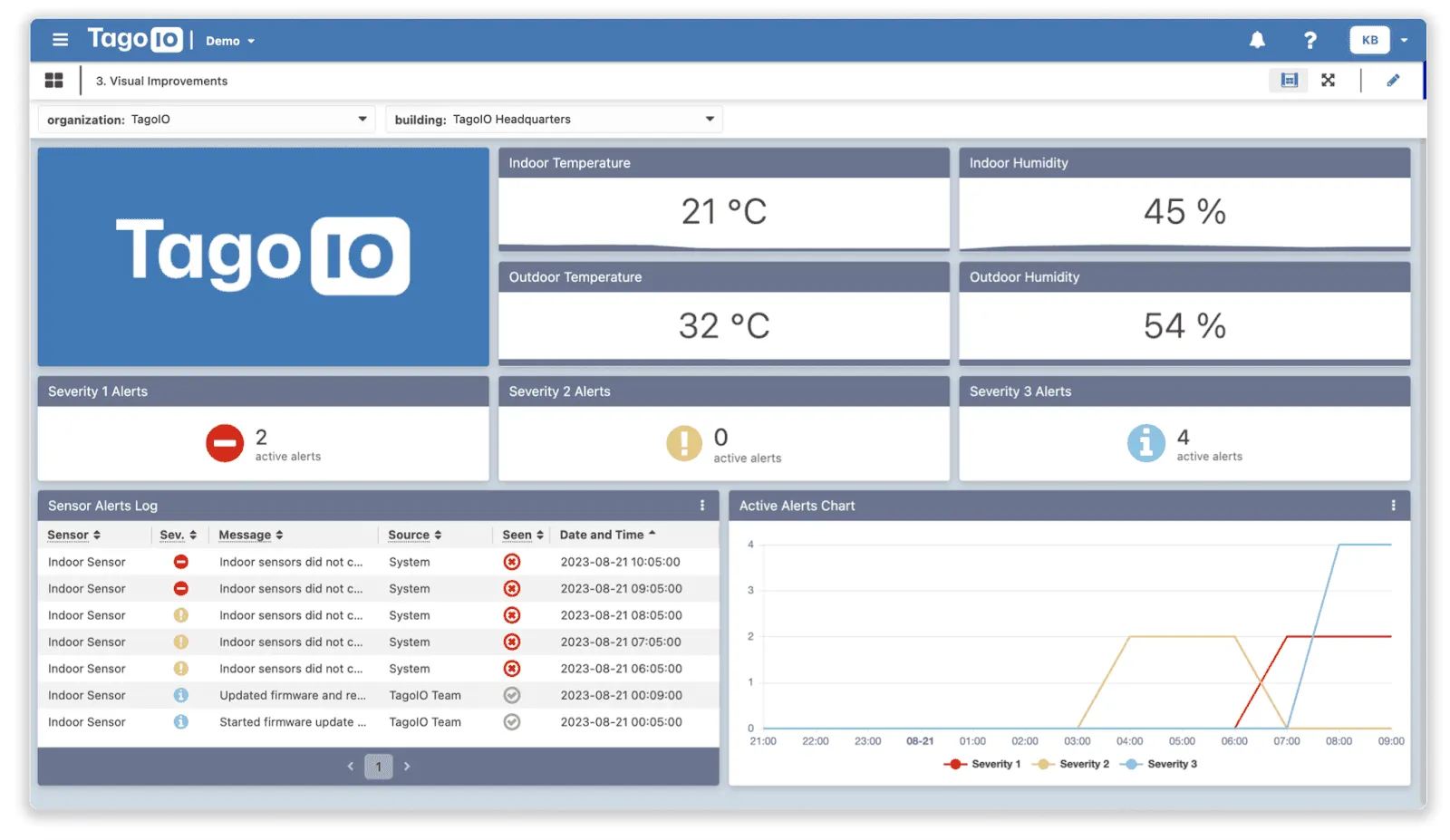
We’ve now colorized all the widgets, which sometimes stands out as the most important task, but adding more context was more effective when it comes to clearing out any possible sources of confusion, which is fairly straightforward since you can customize colors in one widget and copy most of the colors very quickly to the other widgets in the dashboard, and incorporated icons to make alerts more visually distinctive.
Severity levels and Seen status columns now have icons, which act as a quick visual representation that doesn’t require the user to parse a bunch of text.
The colors are all standardized here, so the same colors are being reused in all widgets. If a color means something that needs the user’s attention, every other thing that needs the same amount of attention will use the same color.
The chart has also been edited to have line colors to match the point above.
Additionally, since the current Blueprint Devices selection is for the TagoIO organization, the TagoIO logo now graces. the dashboard, prominently indicating the organization or building it represents.
Effective use of space
Despite our previous iterations, the dashboard still has room for improvement in effectively using the available space. It has become less cluttered, but we can still trim the information down to what is necessary for the dashboard.
Keep in mind that you can make use of other tabs in the same dashboard, other dashboards, and even modal dialogs that are opened on a click of a button placed in the dashboard (e.g., the History button to see the chart)“
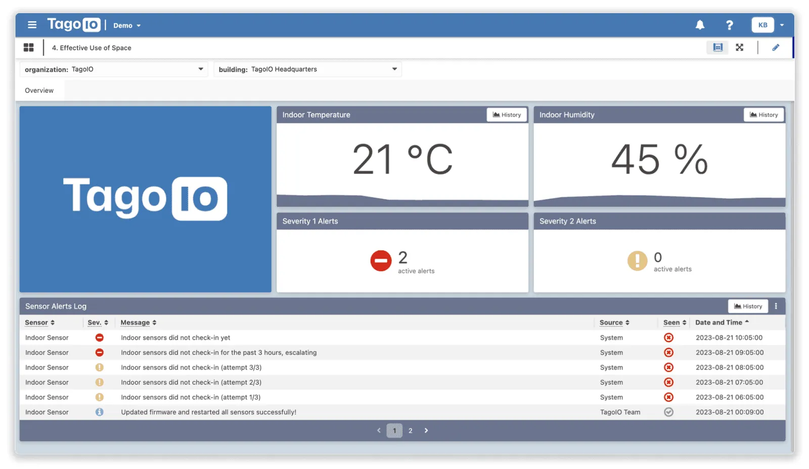
We focused on the most critical data, which in this scenario was indoor temperature and humidity, to optimize space. We removed outdoor information and the less severe alert counters, reducing noise. While this information may be useful on a separate tab, it is not essential for the main dashboard.
If the user sees something useless instead of what they need, they will get frustrated even though they may get used to it. If none of your users care about a piece of information in the dashboard, it takes space from more important things. So, listening to feedback and iterating is very important for effective design.
We also widened the table for improved readability, which is possible since we’ve moved the charts to a modal dialog because, in this use case, it’s less important to see alerts going up and down over time at first glance.
When designing dashboards that can be a joy to use, it’s important to figure out which is the most crucial data to be in a “view” (dashboard or tab) instead of just throwing everything there to see what sticks.
Users may get used to navigating through cramped and cluttered dashboards, but that doesn’t mean they won’t face much frustration, especially if they need looking at data to make informed critical decisions.“
Stellar user experience
Creating a stellar user experience involves attention to detail.
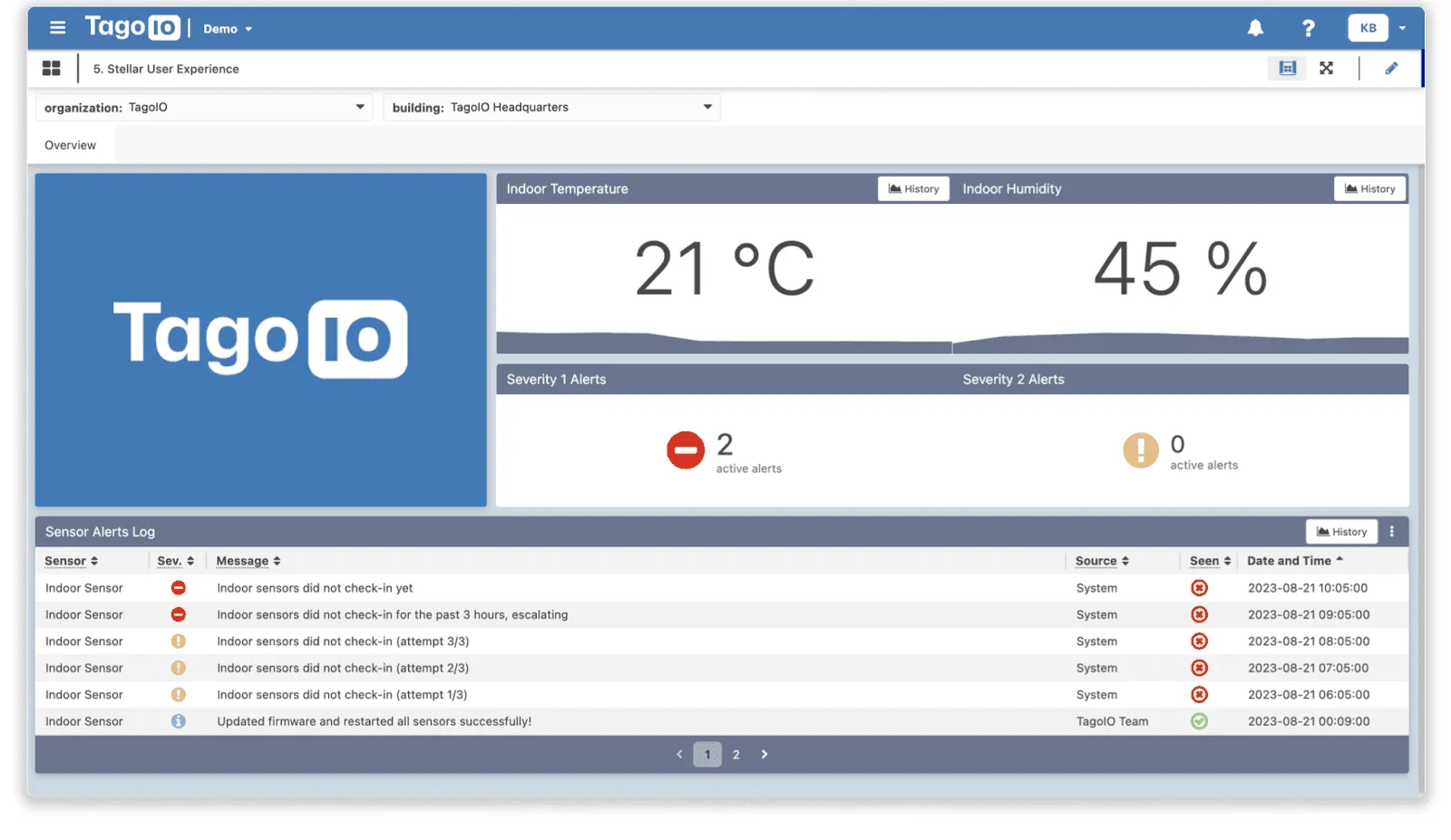
We reduced the space between widgets, allowing users to perceive related information as grouped. Since we have mentioned improving the units before, we have used Dynamic Formulas to allow you to make conversions between any units you need. We’ve highlighted temperature units, but you can provide a great experience to your users by allowing them to select units according to their preferences, which is very important in a global context.
Also, some things that aren’t shown in this blog post are improvements to the user experience. Regarding localization, we offer Dictionaries that are perfect for making your application usable in multiple languages.
When designing this presentation’s dashboards, Dictionary was used in every single widget because languages can be added as needed later on.
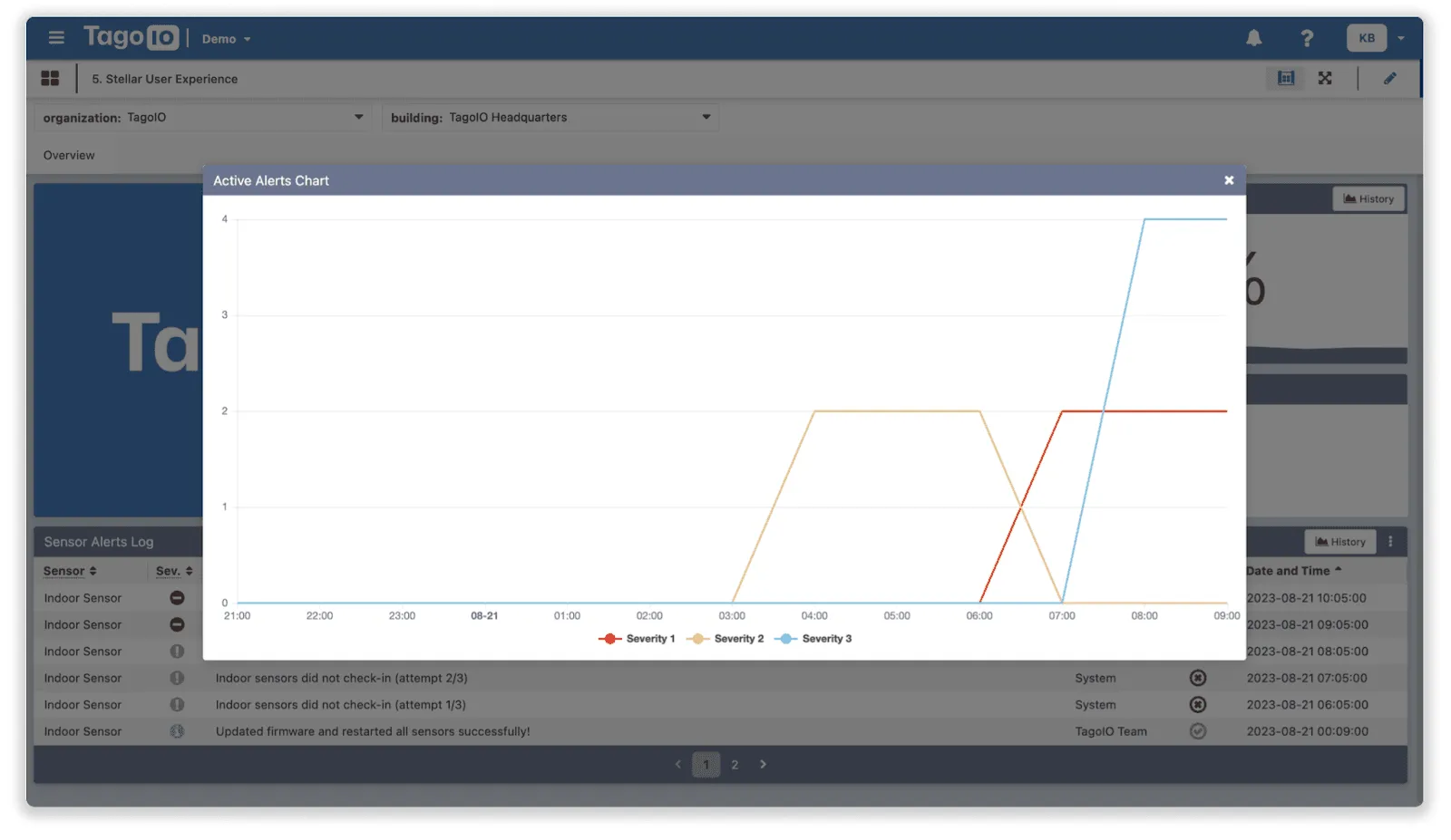
Regarding the chart, clicking the history button on the sensor alert log reveals it, ensuring that non-critical information remains accessible without cluttering the main view. Other features can further improve the experience, such as using Color and Icon Conditions to make the most out of visual indicators and colors.
When using your platform, effective dashboard design comes down to more than just eye candy; it can be done by changing the colors or using transparency and background images.
We’ve taken the iterative approach to highlight that you can take these steps in small increments, and each one can bump the user experience by a significant amount.
Once again this blog post was inspired by the webinar “Designing IoT Dashboards to Amaze your Customers,” where Klaus Borges and David Hall shared insights on designing IoT dashboards. Their expertise, combined with the feedback from over 100 viewers, motivated us to provide this summary. By following these guidelines, you can create dashboards that present data effectively and offer a seamless and engaging user experience, for more similar webinars, visit TagoIO’s YouTube channel.