
Facility managers do not have a data problem. A mid-size commercial building with submetering, HVAC monitoring, occupancy sensors, and leak detection produces more readings in a day than anyone will ever look at, and most facility dashboards respond by showing all of it: walls of gauges and charts that demo beautifully and go unopened by week six. The dashboards that survive daily use are built backwards from a different question. Not “what data do we have,” but “what does the person opening this need to decide in the next ten minutes?”
In practice that produces something specific, and it explains why the best facility UIs now lead with intelligence rather than charts.
The four views a building actually needs
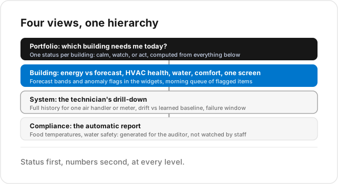
A facility dashboard that works is not one screen. It is a small hierarchy, usually four levels deep.
The portfolio view answers “which building needs me today” for operators with more than one site: a map or list where each building carries a single status, calm, watch, or act, computed from everything below. The building view shows the systems that spend money and cause complaints, energy load against the expected curve, HVAC health, water, comfort zones, on one screen with no scrolling. The system view is where a technician drills into a specific air handler or meter with full history. And the compliance view, temperatures for food areas, water safety checks, is less a dashboard than an automatic report, because its real audience is an auditor.
What every level shares: status first, numbers second. “Chiller 2: attention needed” beats a gauge showing 78.4 in a font nobody can read from a hallway.
Layout follows the building, not the database
The classic mistake is organizing the dashboard by data source, a LoRaWAN page, a Modbus page, a BMS page, because that is how the integration was built. Facility staff think in floors, zones, and systems, so the dashboard should too. On TagoIO this is configuration rather than code: widgets bound to device groups by tags like floor, zone, and system, so the same blueprint serves every building in the portfolio, which is exactly the template discipline that keeps a growing portfolio maintainable.
The real shift: dashboards that think, not just show
Everything above has been the standard advice for years, and it is no longer enough, because even a well-organized dashboard only shows the past. The energy chart shows consumption climbing after it climbed. The comfort panel shows a zone hot after the complaints arrived. Someone still has to open the screen, notice, interpret, and react, and at portfolio scale nobody reliably does.
The facility dashboards worth building in 2026 put the intelligence in the UI itself. The energy widget carries a forecast band, so today’s load is judged against where it should be, and the month-end cost projection updates live. The chiller panel does not just chart vibration; it flags that the pattern started drifting from its learned baseline nine days ago and estimates the window before it becomes a failure, the same predictive maintenance logic that manufacturing runs. The water view converts a 2 a.m. flow anomaly into a leak alert with a location instead of a chart someone might scan on Monday. And the operator’s morning starts with a short queue of flagged items with recommendations attached, not a wall of green gauges hiding one amber one.
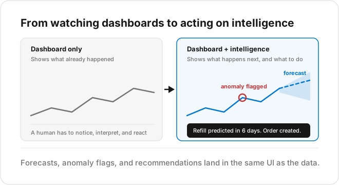
On TagoIO, this layer is not a separate BI product bolted on afterward. Analysis scripts and built-in AI and analytics run forecasting and anomaly detection inside the platform, and the results render in the same widgets as the live data: forecast bands on the energy chart, anomaly flags on the equipment panel, a recommendation card above the fold. The facility manager never learns what a model is. They just stop discovering problems late. The techniques underneath are the ones we covered in forecast-based alerts and energy forecasting.
Alerts: the dashboard for people who do not open dashboards
Most facility staff interact with the system through their phone, not the wall screen, so the alert stream is the dashboard for them. The bar to hold: every alert should carry what happened, where, how bad, and what to do next, and forecast-based alerts should outnumber threshold alerts over time, because “Zone 3 will breach comfort range around 14:00” creates an option while “Zone 3 breached at 14:00” creates an apology.
Where to start
Begin with one building, the four views, and intelligence on the two systems where predictions pay fastest: energy, because the forecast versus actual gap is money every day, and the single most complaint-prone HVAC asset, because early drift detection converts emergencies into scheduled work. Then template it across the portfolio.
TagoIO ships the dashboard layer, the analytics and AI, and connectors for the usual facility hardware, so the build is configuration rather than a software project. There are dashboard templates to start from, and the buildings solution page shows real deployments. Book a demo or start free.